Today’s analysis is on the Stanley Indoor Wireless Remote Control:
[first impression]
My first encounter was at my friend’s house when he showed off how he could wirelessly control the lights in his living room. I was instantly sold and immediately ordered my own. The system was very straightforward to set up: plug the outlet receivers in and connect your devices. Press on/off on the remote to toggle power. When a button is pressed on the remote, feedback is returned as a brief red light to indicate 1) the remote is active and 2) the command was sent.
From my first time interacting with it, I immediately knew how the system worked. Everyone I’ve showed the system to has been able to pick it up on their first try, and they too have shared my surprise with how simple yet useful it is.
[usability]
As a set of simple on/off switches, the remote is easily learnable and very intuitive. Press on to turn your device on. Press off to turn your device off. That’s it. However, there are two things that bothered me once I was a few months into using the system:
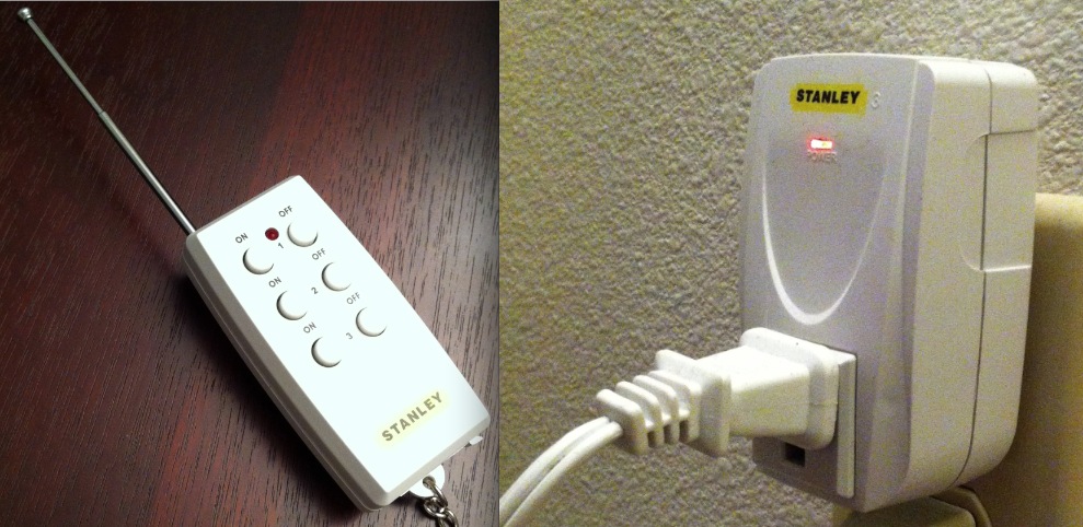
First, the outlet controllers are faintly labelled. In the picture above there is a subtle “3” on the outlet receiver. Distinguishing receivers often takes careful examination. Why aren’t the numbers in black (like they are on the remote) and larger? Users would be able to better identify which receiver is which.
Secondly, there are six buttons when three could perform the job. I’m a fan of the Dieter Rams‘ philosophy of “Less, But Better”. A toggle function only needs one button to use, so why are there two? The A/C button in cars is not composed of an on button and an off button, but rather a single button. In the same way, conventional power switches toggle on/off as opposed to having two buttons. (more on this below)
Despite these two nuances, I do consider this system quite well-designed and very usable.
[overall analysis]
Though a simple product, I have come to rely heavily on this system. All of the lights I use it for have hard-to-reach switches, and this remote/receiver set is a practical and economical (fine, I’ll let you have lazy as well) solution to instantly toggle my lights. The remote has a keychain as well as a three-part antenna, two elements I don’t consider absolutely necessary. I’ve never had reception difficulties and find the remote too bulky to reasonably fit on a keychain, so I’m not quite sure what was the rationale behind the use cases or requirements to include them. Speaking of bulkiness, I wish the receivers didn’t take up so much room; though the electronic internals are beyond me they don’t play along well on power strips.
Now, to expand on my six vs three button thought from above. A valid counter-point is that that single button toggles have some sort of visual feedback marking on/off while this remote doesn’t. A car’s A/C button has a light, and every power button I can think of has visual feedback to distinguish on versus off. This remote has no feedback for state and only displays whether a command was sent with the red light mentioned above. However, the reviews on Amazon show that the primary use case for this system is to control lights or devices that otherwise have obvious visual feedback.
I would prefer a three button remote with larger buttons and labels. Less buttons = simpler and less risk for malfunction. The buttons on the remote are small and quite close together: someone with large thumbs or quickly pressing buttons could easily hit two at the same time. My thoughts would be to reduce the numbers of the buttons and increase their size and the distance between them.
But the buttons and the bulkiness are secondary priorities to the primary requirements of a usable and simple system coupled with a economical price. Stanley was spot on with its fundamentals, and has created a product I can’t live without.
[about DOET]
Last year I read Don Norman’s The Design of Everyday Things. Inspired by Steve Jobs’ biography, I recently began thinking and reflecting on the beauty around me. There is a lot of design coverage and discussion about well known and extraordinary things, such as a Retina Macbook Pro or a Lamborghini Aventador, but there is little towards better understanding the normal objects around us.
For the next 14 13 days, I will randomly choose an everyday household object and conduct a thorough analysis of its design in what I’m calling my Design Of Everyday Things, or DOET, project. My goal with this is to learn more about design through the careful scrutiny of products I would have otherwise overlooked. This is my refusal to take design for granted. Each analysis has three parts: first impression, usability, and overall analysis. I don’t consider this to be a review, but rather an exploration: there will be no numerical rating, purchasing recommendation, or a pro/con section.
Past DOETs: