Today I look at the Moleskine notebook:
[first impression]
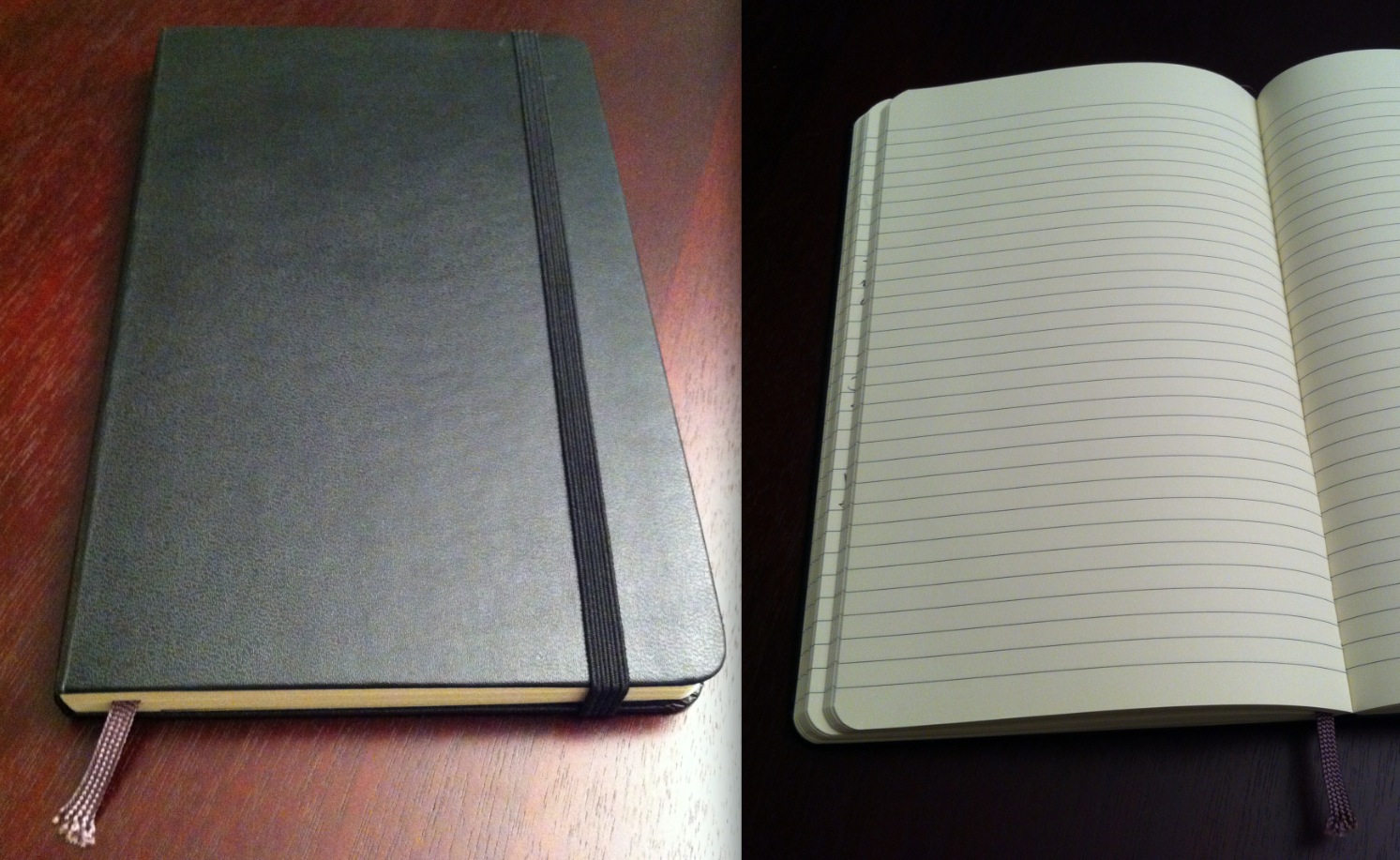
I was given my first Moleskine in December 2009. Since then, I have used them as a daily journal for reflection. I have become a very loyal fan: pictured above is my fifth black Moleskine. Also in my collection are two large red notebooks and a small black one. I was unsure what to do with the notebook at first: it felt like no other notebook I had ever owned. Its cardboard cover, rounded corners, and slightly colored pages made me feel special and the writing I put into it important.
It’s difficult to explain why the notebook feels different, but I have observed similar reactions of awe in others experiencing a Moleskine for the first time. Maybe that’s the magic behind: one doesn’t simply write and read a Moleskine. You experience and interact with it.
[usability]
As a notebook, it would be difficult for the Moleskine not to be usable. But subtle elements of its design deserve my reflections on the broader user experience. The rounded corners are smooth and cleanly angle. The cardboard cover feels soft and comfortable but durable. But the best part is the pages: they are nothing short of incredible to write on. Writing in a Moleskine is like playing a Steinway grand piano or accelerating in a supercar. It feels natural, the way things should be. The notebook becomes an extension of your being. From within arises a feeling that your writing is part of something bigger; that if you give a beautiful effort, you will get a beautiful result.
The Moleskine’s unique size makes it very portable yet spacious enough to record ample sections of writing. It is lightweight, pleasant to hold, and easy to thumb through. The binding and bookmark, both common traits of many modern notebooks, are enjoyable to use and improve the overall experience. Lines on the page feel like college rule and are perfect for my handwriting. The lines are a nice medium gray: distinct enough to help align your writing but subtle enough to enhance the words between them.
[overall analysis]
I tried my best to materialize how I consider the Moleskine so well designed, and here I will think about why its designers did what they did. Why is it 5.2×8.2 inches? Why 240 pages? Why is Moleskine so adamant to handmake each and every notebook? Why does it have an expandable pocket in the back, and what did they designers intend owners to put in it?
I don’t know the specific answers but one thing’s for sure: a notebook with roots in the legendary ones used by van Gogh, Picasso, Hemingway, and many other iconic figures is clearly designed with purpose and tremendous thought. Its popularity is no surprise because it is accessible, inviting, and surprisingly eager to stow your thoughts. The Moleskine is designed for anyone and everyone- all you need is the willingness to write.
[about DOET]
Last year I read Don Norman’s The Design of Everyday Things. Inspired by Steve Jobs’ biography, I recently began thinking and reflecting on the beauty around me. There is a lot of design coverage and discussion about well-known and extraordinary things, such as a Retina Macbook Pro or a Lamborghini Aventador, but there is little towards better understanding the normal objects around us.
For the next 14 12 days, I will randomly choose an everyday household object and conduct a thorough analysis of its design in what I’m calling my Design Of Everyday Things, or DOET, project. My goal with this is to learn more about design through the careful scrutiny of products I would have otherwise overlooked. This is my refusal to take design for granted. Each analysis has three parts: first impression, usability, and overall analysis. I don’t consider this to be a review, but rather an exploration: there will be no numerical rating, purchasing recommendation, or a pro/con section.
Past DOETs: