Today I look at the my car keys:
[first impression]
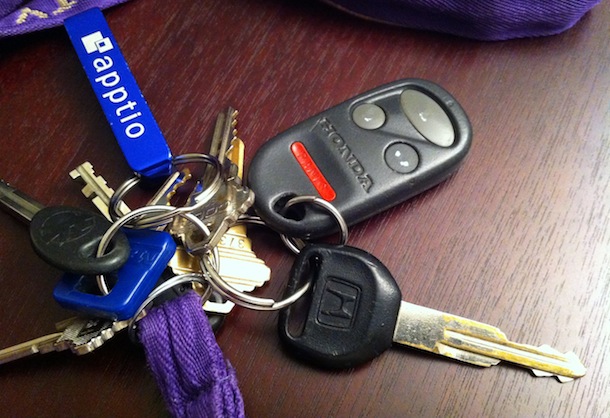
I’ve been driving my trusty CRV ever since I had my permit. My first time using the remote, I immediately knew what to do with it and loved the convenience it offered. Back in 2001 (the year my car was made), I bet remotes were hot thing! Today’s versions combine the key and remote, some don’t even use keys anymore. For this analysis, I’ll be focusing on my specific keys.
[usability]
The remote was simple enough to learn the first time and after spending several years with it I could likely operate its functions in my sleep. Overall I’d consider it pretty usable: as an experienced owner, I never need to look at the buttons to know which one to press. However, when I hand my keys to someone who has never seen this particular remote before they become confused. Years of use have made their mark on the icons and all have faded to white remnants. Though it would have been slightly more expensive, the remote should have been designed with small icons engraved as opposed to printed onto the buttons. Given the choice, I would have gladly paid $10 extra for engraving vs printed.
Also, what’s up with the PANIC button? I can’t think of a single time it was pressed on purpose for its purpose. The designers had good intentions but society doesn’t seem to require or appreciate it. Some may argue that all of the times it’s accidentally activated are worth the one unlikely situation it might be useful for. Then again, our acclimation to rogue car alarms might already lead people to thinking you’re just another careless car owner crying wolf. For the most part, I agree with the philosophy of “having it and not needing it over needing it and not having it”, so I suppose I’m an advocate of keeping it.
[overall analysis]
If you’ve spent time with me in either a sleep-deprived, bored, or thoughtful state you know that I will begin asking a lot of why questions. Examples: Why is chicken called chicken? Why are AA batteries the most popular? Why are circadian rhythms set on daily as oppose to weekly cycles? Why do we have blue skies, green trees, and red sunsets as opposed to purple sunsets, white trees, and green skies? Anyways, I am obligated to ask the same of my keys. But my curiosity isn’t necessary about what’s there (I’ve already vented about the PANIC button) but rather what’s not there. Why isn’t there a button to open the hood? Why don’t stock modern remotes have a start engine button? Why isn’t there a roll-down-the-windows button or at least one to open them to a sliver so your car doesn’t become an oven on a hot day? How about the opposite: why isn’t there a button to roll all the windows back up?
There may be perfectly valid reasons against all of those, especially the argument against a car remote that rivals the TV remote in number of buttons. But that doesn’t mean I won’t ask! Some interesting contemporary technologies such as the smartphone control mini-displays intrigue me and make me wonder about what the future of car remotes will look like. Wikipedia tells me the car remote was first developed in the 1982 under Renault. That was 30 years ago. In three decades, has the car remote changed?
I think it’s time to re-imagine the car remote. Who knows, in 30 years we might not even need a remote. Our cars (or personal spaceships?) will automatically detect our proximity, unlock the doors, and make us a sandwich (or food capsule?).
[about DOET]
Last year I read Don Norman’s The Design of Everyday Things. Inspired by Steve Jobs’ biography, I recently began thinking and reflecting on the beauty around me. There is a lot of design coverage and discussion about well-known and extraordinary things, such as a Retina Macbook Pro or a Lamborghini Aventador, but there is little towards better understanding the normal objects around us.
For the next 14 11 days, I will randomly choose an everyday household object and conduct a thorough analysis of its design in what I’m calling my Design Of Everyday Things, or DOET, project. My goal with this is to learn more about design through the careful scrutiny of products I would have otherwise overlooked. This is my refusal to take design for granted. Each analysis has three parts: first impression, usability, and overall analysis. I don’t consider this to be a review, but rather an exploration: there will be no numerical rating, purchasing recommendation, or a pro/con section.
Past DOETs: