Today I look at the my Timbuk2 Messenger Bag:
[first impression]
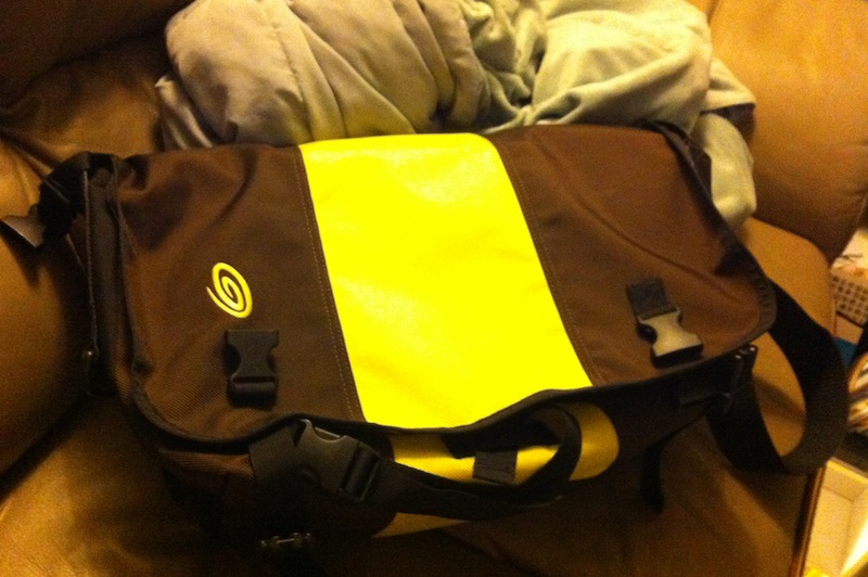
I bought it on a whim for 50% off at the University Bookstore. I had heard many good things about it for years and was eager to hop on the bandwagon. It was great to use from the beginning; it comfortably stowed my laptop, had a brilliant stability strap for when I was cycling, and featured intuitive pockets for my everyday needs. I found myself appreciating the quick release strap adjuster and clip-on reflectors for added visibility. From my first time using it, I was pleased with how durable it felt: they don’t call it durable ballistic nylon for nothing!
[usability]
I consider this bag very usable, right up there with my North Face Recon in terms of well-designed bags. Its San Francisco roots are all over, and it only takes a few minutes of using it to understand what a versatile bag designed for active urban technophile (especially cyclists) should feel like. Aesthetically, I love how the bag looks with its three panel front and symmetrical straps. The large velcro panels that keep the top flap down are extremely convenient and perfect for quick retrieval.
However, a characteristic of the bag that bothers me is how it feels when you carry it by the handle. Loaded with my laptop, charger, water bottle, and more, it hangs at an unnatural angle. Unlike a briefcase (which hangs perpendicular to the ground), it sits at an angle with the outside of the bag partially facing downward. The same velcro I raved about above seems to be part of the cause of this awkward angle since the design doesn’t allow the handle to be placed farther up in the position a briefcase uses. Thankfully, the bag is usually on my shoulder so I seldom run into this minor annoyance.
Another trait that bothers me is how narrow the individual pen pouches are. They easily fit a standard pencil, but most of my mechanical pencils and pens won’t fit without forcing them in. Sure, I can put them in the larger compartment behind the individual pouches but that compartment doesn’t seem designed for them. I would like to see individual pouches that can stretch farther out; they don’t have to be wider, just utilize a larger circumference so common pens and mechanical pencils can fit easier.
[overall analysis]
A Timbuk2 bag is more than a bag and a brand; to me it has become an icon and an experience. Whenever I work outside my house, I consider this messenger bag as essential as my laptop and pens that go in it. It has become my trustworthy noble steed to house everything I need on the road. It performs wonderfully in the active and often fast-paced situations that I put it through, and is always asking for more.
There is a special place in my heart for products that empower (or at least feel like they empower) me to become better. Just as my camera empowers me to artistically express myself and my computer empowers me to design, my messenger bag empowers me to face the challenges I meet on the road. The way I see it, this kind of empowering user experience is unbelievably hard to design for. I’d even argue that designing with the goal of empowering won’t lead to an empowering design; you can only arrive at them by connecting to the innermost fiber of your being and almost let the product naturally design itself. Empowering products transcend ordinary designs because they have a clear sense of purpose and strive to fit into a greater synergy that goes beyond themselves. And there you have one of my main goals for DOET: to uncover and explore the underlying elements that make the everyday designs empowering.
[about DOET]
Last year I read Don Norman’s The Design of Everyday Things. Inspired by Steve Jobs’ biography, I recently began thinking and reflecting on the beauty around me. There is a lot of design coverage and discussion about well-known and extraordinary things, such as a Retina Macbook Pro or a Lamborghini Aventador, but there is little towards better understanding the normal objects around us.
For the next 14 10 days until September, I will randomly choose an everyday household object and conduct a thorough analysis of its design in what I’m calling my Design Of Everyday Things, or DOET, project. My goal with this is to learn more about design through the careful scrutiny of products I would have otherwise overlooked. This is my refusal to take design for granted. Each analysis has three parts: first impression, usability, and overall analysis. I don’t consider this to be a review, but rather an exploration: there will be no numerical rating, purchasing recommendation, or a pro/con section.
Past DOETs:
you might’ve gotten a 2011 model, which has the weird internal organizer design with removable pockets that look more like hard slabs with velcro. the 2012 model (i have a custom one lol) has big wide inner pockets which i far, far prefer. fun fact, i used to have a 2011. then i called timbuk2 to complain about the poor design of the internal organizers, and they agreed with me and gave me a 50% off coupon for their site, with which i bought a 2012. 🙂