Today I look at the my Pur Water Filter:
[first impression]
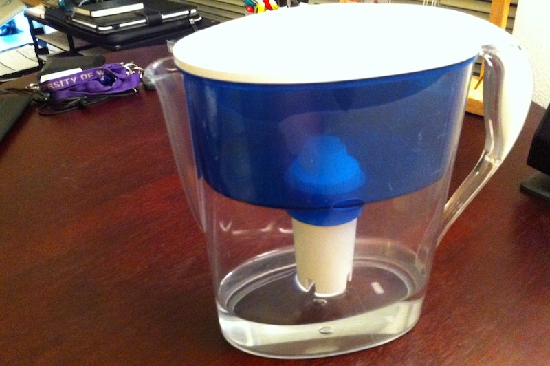
I bought this filter at Bed Bath & Beyond my freshman year. It was on sale and I really liked its transparent blue design. My first impression was fairly positive: it was easy to use, had simple components, and was the most modern-looking water filter I had owned. (that’s not saying much, since it’s my second one after an old Brita) It held an ample capacity of water, and filtered a full load within a few minutes.
[usability]
My appreciation for the transparent blue design is both aesthetic and functional. It allows you see how much water has yet to be filtered, a feature I haven’t seen in the several Brita filters I’ve tried. The handle offers a sturdy grip and feels natural in your hand. The opening allows water to efficiently pour out but still be well-controlled. The filter is straightforward to replace, sliding in and out of its compartment easily.
The top is easy to pop off for quick filling, but sometimes I consider it too easy. When I fill it beyond 95% and have to move it, there is a good chance the water inside will move around and even come out. This is where I appreciate the isolated top that comes on modern Brita filters, such as this one. It would be great to have a top that has a higher threshold against internal loosening but a similar threshold for external release, perhaps in the form of a release trigger or button? For now, I’ve learned to keep it stationary while I wait for the water level to drop.
[overall analysis]
I have come to love this filter; when I’m at home I usually refill it every 90 minutes. I’m comfortable leaving it on my computer desk because it’s modern blue/white/transparent design allows it to fit right in. To me, Brita feels “old-school” and traditional while Pur is hip and modern. The oval shape is very nicely rounded, providing a solid structure, planted base, and contemporary look. While many people might overlook the design put into their water filter, I want to give kudos to the designers of my Pur filter for a job well done.
[about DOET]
Last year I read Don Norman’s The Design of Everyday Things. Inspired by Steve Jobs’ biography, I recently began thinking and reflecting on the beauty around me. There is a lot of design coverage and discussion about well-known and extraordinary things, such as a Retina Macbook Pro or a Lamborghini Aventador, but there is little towards better understanding the normal objects around us.
For the next 14 8 days, I will randomly choose an everyday household object and conduct a thorough analysis of its design in what I’m calling my Design Of Everyday Things, or DOET, project. My goal with this is to learn more about design through the careful scrutiny of products I would have otherwise overlooked. This is my refusal to take design for granted. Each analysis has three parts: first impression, usability, and overall analysis. I don’t consider this to be a review, but rather an exploration: there will be no numerical rating, purchasing recommendation, or a pro/con section.
Past DOETs: