Today I look at my Sony TV Remote:
[first impression]
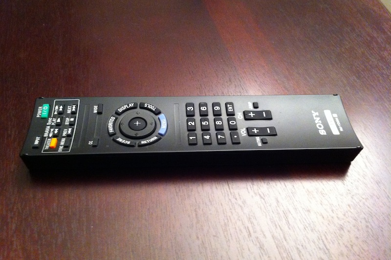
This is the remote that came with my TV, which I’ve had for about a year and a half. The first thing I noticed about it was the strangely curved top. I was used to fairly flat remotes, and this design struck me as something original and different. I was initially impressed with the simplicity and elegance of the button layout. It felt organized yet aesthetically pleasing. Important buttons were color-coded to stand out and the Power / Functions+Navigation / Numbers / Volume+Channel layout agreed with my idea of the correct button hierarchy. The remote was very easy to use from the beginning, and it only took me a few uses to be able to operate it by touch because of its intuitive organization.
[usability]
I have come to appreciate the curve of the top- it allows easy grip from any side of the remote and for easy operation of the buttons. Its concave design allows buttons in any row to be easily pressed, and is a much better design than any convex remote because it reduces the distance your thumb has to reach to hit a button on the far side. Letters and numbers are easy to read; the font size is generously large yet efficiently compact. The labels are also fairly durable; after a year and a half they show no signs of wear. Padding around words/numbers is even and nicely centered.
The one strange thing about this remote is the power button on the bottom. Yes, this remote has two power buttons: the obvious green top button and a strange black one on the bottom. While an interesting addition, I have never found good use for the bottom button. I usually forget about it and only remember its there when I don’t need it. However, it is very intuitively placed. A natural grip on the remote with your thumb over the numbers will leave your middle finger covering the bottom button. Thankfully it is inset and not easily activated, otherwise it would lead to many accidental power-offs.
[overall analysis]
Though I don’t use this remote as much as I should (thanks to laziness to find it and impatience), it has performed its job excellently and enriched my experience with my TV. That said, there are many buttons that I have never used. The BRAVIA Sync area is irrelevant for me since I don’t own any compatible products and I have never found use for the Scene, Favorites, or Tools buttons in the circular group. I love the placement decision that put Return to the left of Menu, and I appreciate that my more frequently used Volume is to the left of Channel (its more natural to adjust volume than channel with my right thumb).
The slim, long, and concave design of the remote leads to a supplementary product that is both pleasing to look at and enjoyable to use. A considerable amount of effort must have gone into designing it, and were it not for my DOET project I would have overlooked its elegance. After analyzing the remote, I have to say that I appreciate it almost as much as my TV!
[about DOET]
Last year I read Don Norman’s The Design of Everyday Things. Inspired by Steve Jobs’ biography, I recently began thinking and reflecting on the beauty around me. There is a lot of design coverage and discussion about well-known and extraordinary things, such as a Retina Macbook Pro or a Lamborghini Aventador, but there is little towards better understanding the normal objects around us.
For the next 14 6 days, I will randomly choose an everyday household object and conduct a thorough analysis of its design in what I’m calling my Design Of Everyday Things, or DOET, project. My goal with this is to learn more about design through the careful scrutiny of products I would have otherwise overlooked. This is my refusal to take design for granted. Each analysis has three parts: first impression, usability, and overall analysis. I don’t consider this to be a review, but rather an exploration: there will be no numerical rating, purchasing recommendation, or a pro/con section.
Past DOETs: